Understanding Multicollinearity
02 Dec 2014To install Systematic Investor Toolbox (SIT) please visit About page.
Eran Raviv blogged about Multicollinearity at Understanding Multicollinearity
Also interesting Heteroskedasticity tests
Let’s have a deeper look.
y = x1 + x2 + e, x1 and x2 are correlated
generated.correlated.lm <- function(TT = 50, niter = 100, cc) {
	load.packages('MASS')
	sigma = matrix(c(1, cc, cc, 1), nr=2)
	x = mvrnorm(TT * niter, rep(0, 2), sigma)
	e = rnorm(TT * niter)

	stat = matrix(nrow = niter, ncol = 7)
		colnames(stat) = spl('x1,x1.se,x1.t,x2,x2.se,x2.t,cor')

	for (i in 1:niter) {
		index = (1 + (i-1)*TT) : (i*TT)
		stat[i,'cor'] = cor(x[index,1], x[index,2])

		y = rowSums(x[index,]) + e[index]
		lm0 = ols(cbind(1,x[index,]), y, T)

		stat[i,c('x1','x2')] = lm0$coefficients[2:3]
		stat[i,c('x1.se','x2.se')] = lm0$seb[2:3]
		stat[i,c('x1.t','x2.t')] = lm0$tratio[2:3]
	}
	stat
}

library(SIT)

stat = lapply(seq(.99,0.75,-.01), function(i) generated.correlated.lm(cc = i))

x = sapply(stat, function(x) mean(x[,'cor']))
y1 = sapply(stat, function(x) mean(x[,'x1']))
y2 = sapply(stat, function(x) mean(x[,'x2']))

layout(matrix(1:6,nc=2))
plot(x,y1,type='p', col='green', las=1, xlab='Mean Cor', ylab='Mean Beta')
	points(x,y2, col='red')
	lines(x, (y1+y2)/2, col='black')

y1 = sapply(stat, function(x) mean(x[,'x1.se']))
y2 = sapply(stat, function(x) mean(x[,'x2.se']))

plot(x,y1,type='p', col='green', las=1, xlab='Mean Cor', ylab='Mean SE')
	points(x,y2, col='red')

y1 = sapply(stat, function(x) sd(x[,'x1']))
y2 = sapply(stat, function(x) sd(x[,'x2']))

plot(x,y1,type='p', col='green', las=1, xlab='Mean Cor', ylab='Sd Beta')
	points(x,y2, col='red')


y1 = sapply(stat, function(x) sd(x[,'x1.se']))
y2 = sapply(stat, function(x) sd(x[,'x2.se']))

plot(x,y1,type='p', col='green', las=1, xlab='Mean Cor', ylab='Sd SE')
	points(x,y2, col='red')

y1 = sapply(stat, function(x) mean(x[,'x1.t']))
y2 = sapply(stat, function(x) mean(x[,'x2.t']))

plot(x,y1,type='p', col='green', las=1, xlab='Mean Cor', ylab='Mean T')
	points(x,y2, col='red')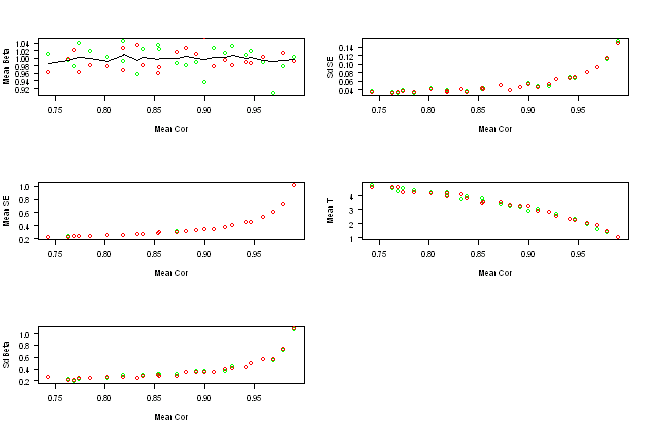
As we increase correlation the standard deviation goes up and T stat goes down, as expected.
(this report was produced on: 2014-12-07)