FX Correlation
09 Mar 2015To install Systematic Investor Toolbox (SIT) please visit About page.
The QuantDare posted an interesting post about FX Correlations at Predicting Gold using Currencies
Below I will try to adapt a code from the posts:
#*****************************************************************
# Load historical data
#*****************************************************************
library(SIT)
load.packages('quantmod')

tickers = '
GOLD = GOLDPMGBD228NLBM # Gold Fixing Price 3:00 P.M. (London time) in London Bullion Market based in U.S. Dollars
AUDUSD = DEXUSAL # U.S./Australia
NZDUSD = DEXUSNZ # U.S./NewZealand
CADUSD = DEXCAUS # Canada/U.S. (convert)
CHFUSD = DEXSZUS # Switzerland/U.S. (convert)
JPYUSD = DEXJPUS # Japan/U.S. (convert)
'

data = new.env()
getSymbols.extra(tickers, src = 'FRED', from = '1900-01-01', env = data, auto.assign = T, set.symbolnames=T, getSymbols.fn=quantmod:::getSymbols)
#print(bt.start.dates(data))

for(i in data$symbolnames)
	data[[i]] = make.stock.xts(na.omit(data[[i]]))

# convert
data$CADUSD = 1 / data$CADUSD
data$CHFUSD = 1 / data$CHFUSD
data$JPYUSD = 1 / data$JPYUSD

bt.prep(data, align='remove.na', fill.gaps=T)

#*****************************************************************
# Setup
#*****************************************************************
prices = data$prices
	n = ncol(prices)

# Check data
plota.matplot(scale.one(data$prices[,2:n]),main='Asset Performance')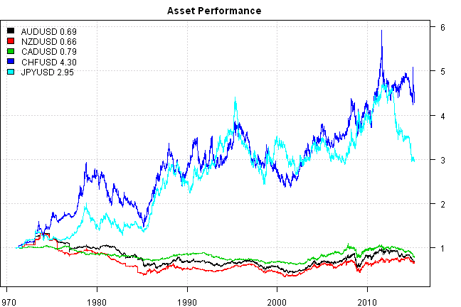
layout(matrix(1:2,nr=1))
index = '2000::'
prices = prices[index,]
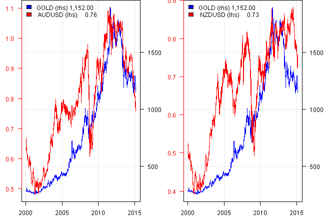
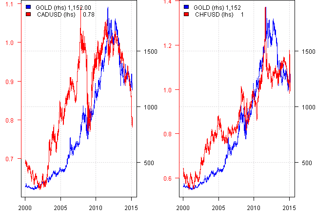
for(i in 2:n) {
plota(prices[,1], type = 'l', LeftMargin=3, col='blue')
plota2Y(prices[,i], type='l', las=1, col='red', col.axis = 'red')
plota.legend(paste('GOLD (rhs),', names(prices)[i], '(lhs)'), 'blue,red', list(prices[,1],prices[,i]))
}
prices = data$prices

#*****************************************************************
# Correlations
#*****************************************************************
map = list('1d'=1, '1w'=5, '2w'=10, '1m'=20, '2m'=40, '3m'=60)
result = matrix(NA, nr=len(map), nc=n-1)
	colnames(result) = names(prices)[-1]
	rownames(result) = names(map)

for(i in 1:len(map)) {
	ret = prices / mlag(prices, map[[i]]) - 1
	cor = cor(coredata(ret[index,]), use='complete.obs',method='pearson')
	result[names(map)[i],] = cor[,'GOLD'][-1]
}

layout(1)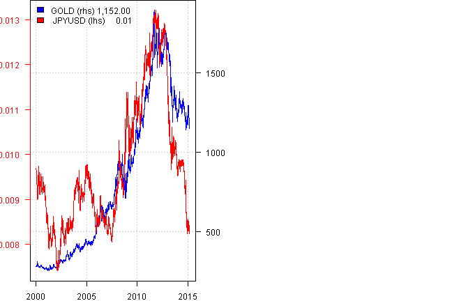
barplot(result, main="Correlations", legend = rownames(result), beside=TRUE, col=col.add.alpha(1:len(map),100))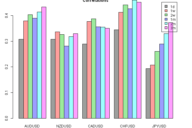
#*****************************************************************
# Rolling 3 Year Correlations
#*****************************************************************
ret = prices / mlag(prices, 1) - 1

result = NA * prices
for(i in 2:n)
	result[,i] = runCor(ret[,1], ret[,i], 3*250)

plota.matplot(result[index,-1],main='3YR Rolling correlations with Gold')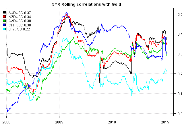
#*****************************************************************
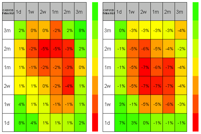
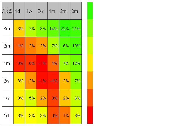
# Lead / Lag relationship
#*****************************************************************
# asset, gold future return, asset past return
result = array(NA, c(n, len(map), len(map)), list(names(prices), names(map), names(map)))
for(i in 1:len(map)) {
# future returns
gold = mlag(prices, -map[[i]]) / prices - 1
gold = coredata(gold[index, 'GOLD'])
for(j in 1:len(map)) {
# historical returns
ret = prices / mlag(prices, map[[j]]) - 1
result[,i,j] = cor(gold, coredata(ret[index,]), use='complete.obs',method='pearson')
}
}
layout(matrix(1:2,nr=1))
for(i in 2:n)
plot.table(to.percent(result[i,len(map):1,], 0), smain=paste(names(prices)[i],'Future/Hist',sep='\n'), highlight = TRUE, colorbar = TRUE)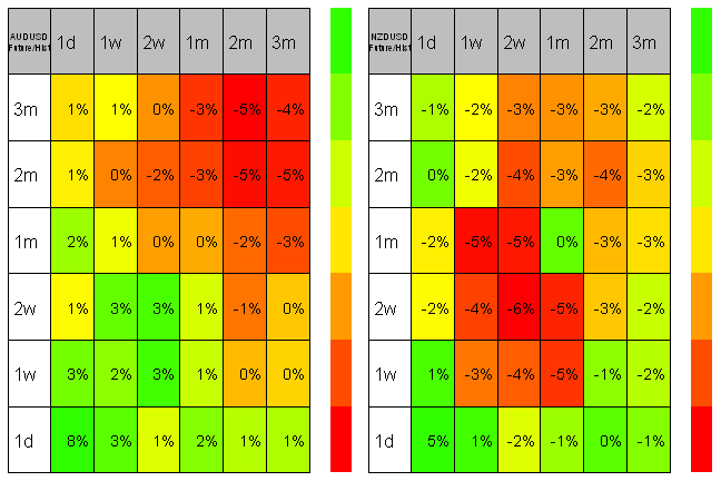
To be continued…
(this report was produced on: 2015-03-22)